利用Vue.extend定义全局组件
大约 3 分钟
一,vue.extend基本概念和用法
使用基础 Vue 构造器,创建一个“子类”。参数是一个包含组件选项的对象。
data 选项是特例,需要注意 - 在 Vue.extend() 中它必须是函数。
<div id="mount-point"></div>
// 创建构造器
var Profile = Vue.extend({
  template: '<p>{{firstName}} {{lastName}} aka {{alias}}</p>',
  data: function () {
    return {
      firstName: 'Walter',
      lastName: 'White',
      alias: 'Heisenberg'
    }
  }
})
// 创建 Profile 实例,并挂载到一个元素上。
new Profile().$mount('#mount-point')
二,为什么要使用extend
常规办法,我们的所有页面都是用router进行管理,组件也是通过import进行局部注册,也会存在不足的地方。
例如:假设我们需要从接口动态渲染组件的情况?如何实现一个类似window.alert()类似的提示组件,要求调用js一样使用?
接下来我们使用Vue.extend来构造一个自定义弹窗基本步骤如下:
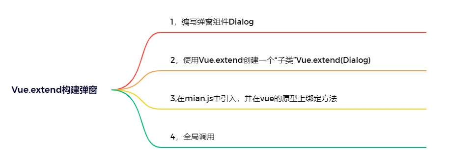
2.1 创建Dialog.vue组件
<template>
    <div v-if="show" ref="modal" class="ek-modal_wrap">
        <div class="ek-modal-content">
            <div class="modal-title-wrap">
                <div class="modal-title">{{ title }}</div>
                <slot name="description"></slot>
            </div>
            <div class="modal-button">
                <a v-if="confirmVisible" class="contral-btn confirm-btn" href="javascript:;" @click="confirm">{{
                    confirmText
                    }}</a>
                <a v-if="cancleVisible" class="contral-btn cancle-btn" href="javascript:;" @click="cancle">{{ cancleText }}</a>
            </div>
        </div>
    </div>
</template>
<script>
    export default {
        data () {
            return {
                show: true,
                title: '', // 标题
                confirmText: '确定', // 确认文字
                confirmVisible: true, // 是否展示确认按钮
                onConfirm: () => { // 确认执行函数
                    this.$emit('confirm')
                },
                cancleText: '取消', // 取消文字
                cancleVisible: true, // 是否展示取消按钮
                onCancle: () => { // 取消执行函数
                    this.$emit('cancle')
                }
            }
        },
        methods: {
            confirm () {
                this.onConfirm()
                this.close()
            },
            cancle () {
                this.onCancle()
                this.close()
            },
            close () {
                this.show = false
                if (this.$refs.modal) {
                    this.$refs.modal.remove() // 关闭时候直接移除当前元素
                }
            }
        }
    }
</script>

<style lang="less" scoped>
    .ek-modal_wrap {
        position: fixed;
        top: 0;
        left: 0;
        z-index: 999;
        width: 100%;
        height: 100%;
        font-size: 28px;
        background: rgba(0, 0, 0, 0.7);
        .ek-modal-content {
            position: fixed;
            top: 50%;
            left: 50%;
            min-width: 7.2rem;
            overflow-x: hidden;
            overflow-y: hidden;
            text-align: center;
            background-color: white;
            border-top-left-radius: 0.266667rem;
            border-top-right-radius: 0.266667rem;
            border-bottom-right-radius: 0.266667rem;
            border-bottom-left-radius: 0.266667rem;
            transform: translate(-50%, -50%);
            .modal-title-wrap {
                display: flex;
                flex-direction: column;
                flex-grow: 1;
                justify-content: center;
                min-height: 55px;
                padding: 0 20px;
                color: #333;
            }
            .modal-title {
                display: flex;
                flex-direction: column;
                flex-grow: 1;
                justify-content: center;
                min-height: 100px;
                margin-top: 30px;
                margin-bottom: 30px;
                font-weight: 600px;
                line-height: 50px;
                color: #333;
            }
            .modal-button {
                display: flex;
                line-height: 1;
                color: #333;
                border-top-color: #e7e7e7;
                border-top-style: solid;
                border-top-width: 1px;
                & > a {
                    color: #333;
                }
                .contral-btn {
                    flex-basis: 0%;
                    flex-grow: 1;
                    flex-shrink: 1;
                    font-weight: 600px;
                    line-height: 3;
                    text-align: center;
                    &.cancle-btn {
                        border-left-color: #e7e7e7;
                        border-left-style: solid;
                        border-left-width: 1px;
                    }
                }
            }
        }
    }
</style>
2.2 创建一个dialog.js
/**
 Created by zxf on 2022/6/13
 */
import Vue from 'vue'
import Dialog from './Dialog.vue'

function showDailog (options) {
    // 1,使用Vue.extend创建一个"子类",参数是包含组件选项的对象
    let dialog = Vue.extend(Dialog) // 返回一个实例创建的构造器,但实例构造器需要进行挂载到页面中

    // 2,实例化并挂载
    let dialogInstance = new dialog({ el: document.createElement('div') })

    // 3,接收外部参数--并进行创建组件的逻辑处理
    for (let key in options) {
        dialogInstance[key] = options[key]
    }
    // 4,将元素插入body中
    document.body.appendChild(dialogInstance.$el)
}
// 将逻辑函数进行导出和暴露
export default showDailog
2.3 在main.js中挂载到全局
import jcDialog from '@/components/jcDialog.js'
Vue.prototype.$showDialog = jcDialog;
2.4 调用
this.$showDialog({
    title: '测试弹窗',
    confirmText: '确定',
    cancelVisible: false
});